Vancouver Eco Footprint 2020
Web Development Project
Vancouver Eco Footprint 2020 is a front-end web development project that aims to educate the audience how Vancouver aims to be the cleanest city in the world by 2020.
>The Road to the Greenest City 2020 Website<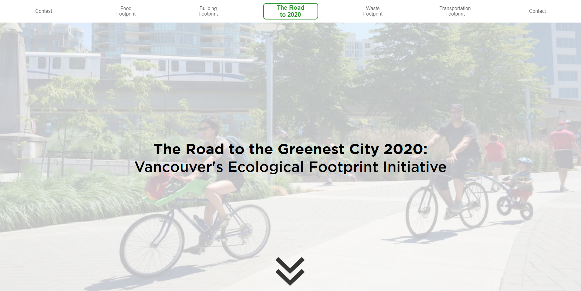
Context
The team consists of 3 members, intending to arrange the Vancouver city government's information and apply it on a website to educated online visitors. My role is to develop two of the web pages and design an offline physical promotion property to attract new users to our website.
Time Frame
The academic assignment started at the beginning of January 2018 and ended in April. The team would work on the task for 6 hours per week.
- Brainstorm
- Website page journey setup
- Graybox
- HTML & CSS
- Offline property design
- Presentation + Hubbub10 participation
Objective
Vancouver's road to 2020 is an academic project aiming to teach individuals about Vancouver's projected future to reduce its ecological footprint by 2020. The team created a website and a prototype compass card concept. With only pie charts and scientific research documents, this project aims to simplify the given data and promote Vancouver's aim to become the greenest city in the world.
Tools
- Adobe Photoshop
- Adobe Illustrator
- Atom Code Editor
Skills
- Greyboxing
- idea Sketching
- HTML & CSS
- Prototype Sketch
Sitemap
My team and I started with a goal in mind, to educate and communicate Vancouver's ecological footprint to potential users. The team prioritizes information functionality for the class course's content. The purpose of the website is to educate and inform the users in the fastest way possible.
We started with a sitemap to have a bigger picture of what the pages might be and organize the necessary content on each page. There was a lot of information provided by the City of Vancouver. Therefore, the task is to ask ourselves which information is more critical in lamen's perspective.
Visual Element
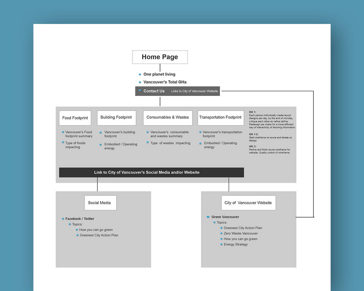
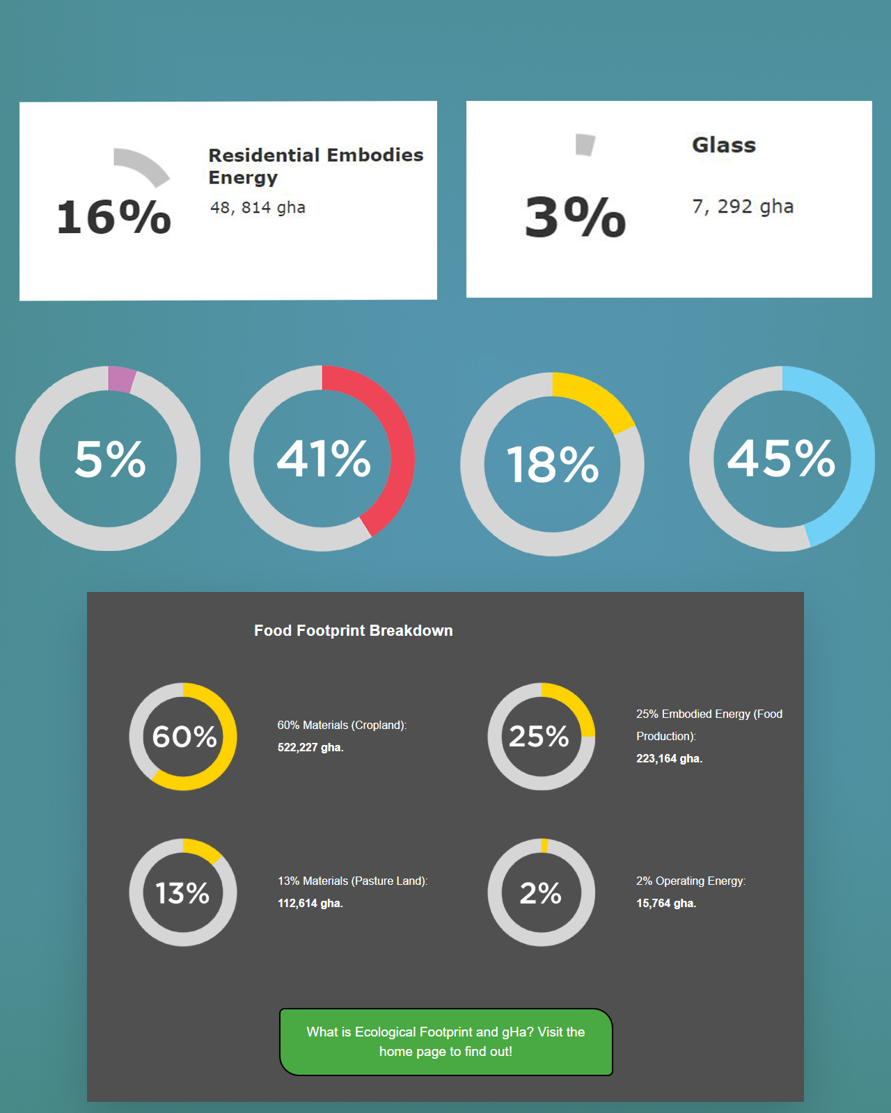
The city of Vancouver provided source materials such as 'Ecocity Footprint Overview' and 'Ecological Footprint Assessment' data graphics for the course. Our task as designers is to figure out where and how do we develop a website and communicate to a broad audience with the following data we received.
Information Design
Decision Process
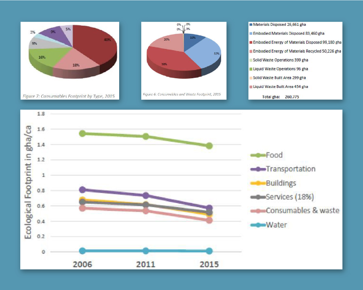
Information display such as the pie charts and line graphs needs to be represented differently in a way that visitors will not look away immediately. Based on our readings, academically approved articles, and along with our lecture notes, there are many studies that reveals why an average person has a habit not to view pie charts or bar graphs to retain information.
Statistical Graphics
I proposed a more satisfying alternative, for instance, groups of gauges that work similarly to a vehicle odometer to represent information. Some challenges include technical language and word count.
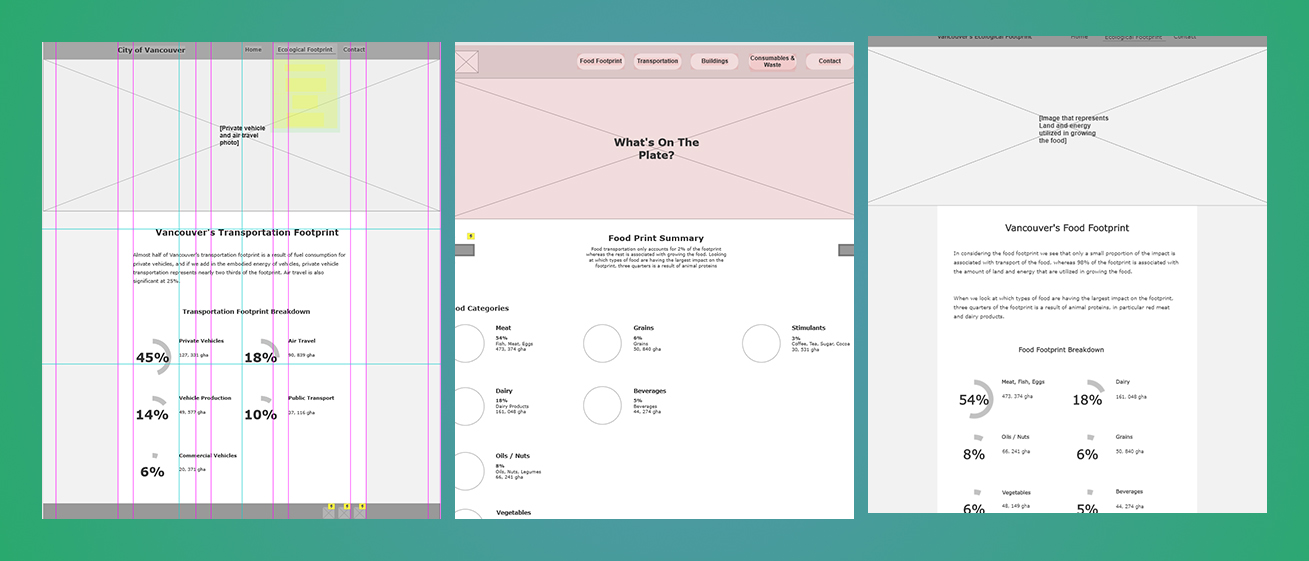
Wireframe
Menus & Content
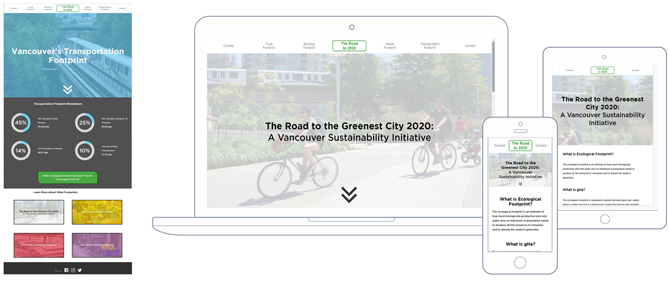
We started with a simple wireframe to get a general feeling where the content should go. The team made several design choices whether or not to have the information displayed right away on the home page. We believed that a general outline with several introduction information is sufficient. There were also different design iteration how the navigation menu should operate. The team eventually laid out all the webpages across the header instead of a dropdown navbar style.
Offline Physical Prototype
Development process
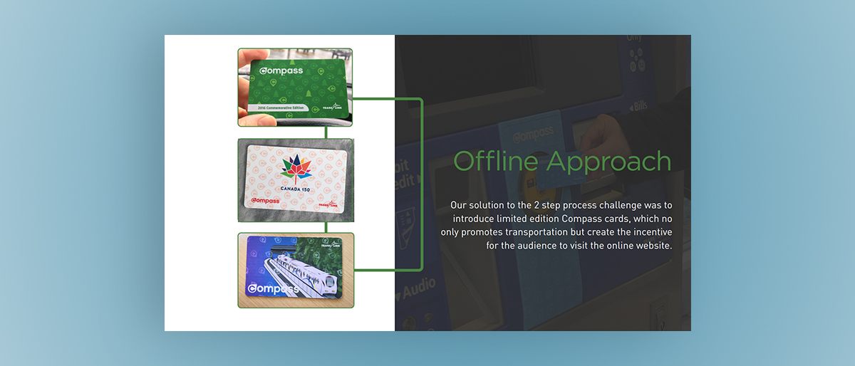
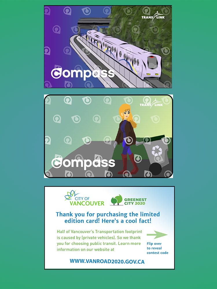
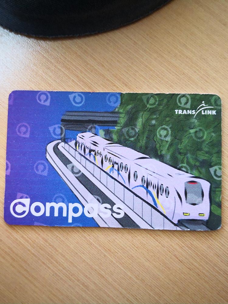
For the offline approach of the project, the team settled with the idea of limited-edition compass cards can help incentivize users to use our website. I decided to go with four different themes, food, transportation, recycling, and renewable energy. The last page will feature a limited-edition compass pass contest page, which will feature a portal in which users can sign up to win one month worth of unlimited Transit access.
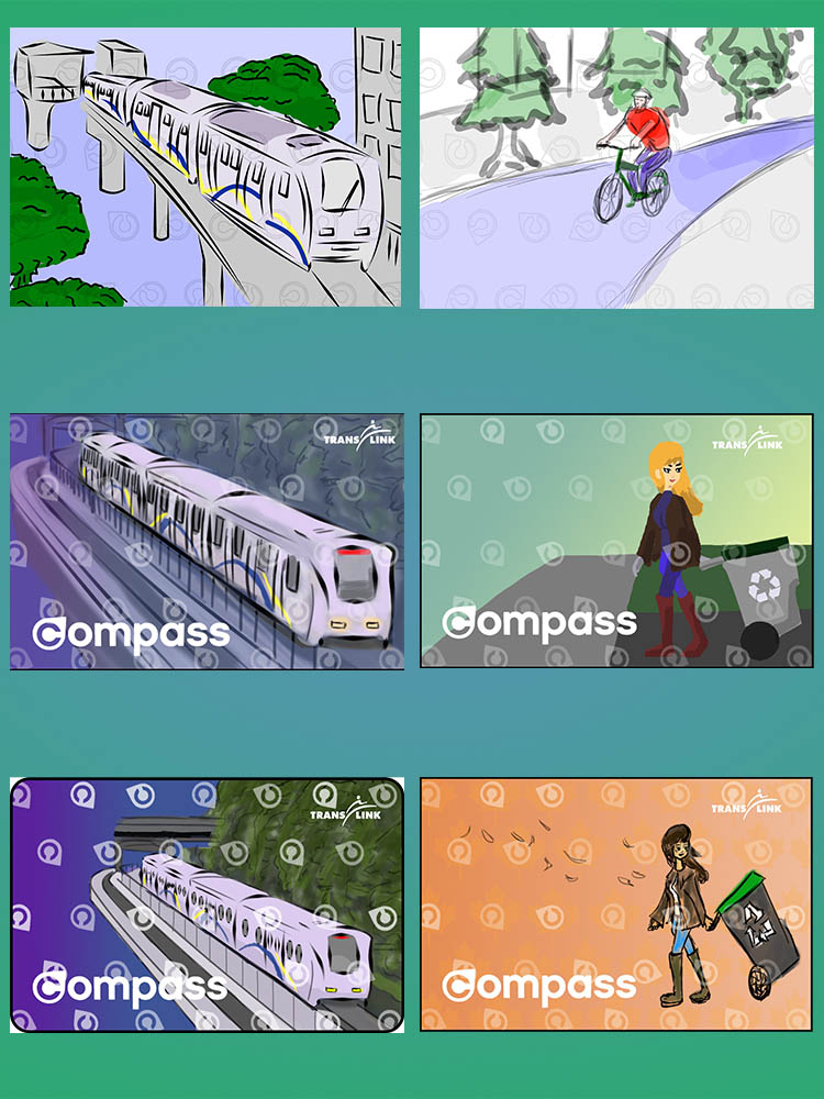
Prototype
Website Design Presentation
The final product was able to participate in Vancouver's CITY STUDIO Hubbub #10 event. Several participants enjoyed the project's offline approach; others gave feedback on the website's overall methods of displaying the ecological footprint information. In the end, the concept project was able to receive the people's choice award.
The Compass Card
When the customer purchases a limited-edition compass card, it will display facts about the average ecological footprint by people living in Vancouver. On the backside of the card will provide the customer with an invitation code that they can redeem it on the website.
Final Thoughts
My team and I were able to brainstorm and produce different design solutions. Looking through everyday displays, I proposed to my team that gauges are one of the interfaces that can retain people's attention. Although the website's aesthetics can be further improved visually, the basic functionality and navigation methods met the course's expectations. As my first HTML/CSS coding website experience, I learned the basics of website programming and basic optimal interface design with strong coding ethics.